We recently spoke to concept artists Matthew Savage, Dan Walker and Alex Fort to find out about the Cybermen designs that never made it to the screen. We also caught up with Neill Gorton from Millennium FX to find out how the Cybermen were redesigned and brought to life for the 21st Century.
WHO SFX: What were your memories of the original Cybermen?
MATTHEW: Everyone’s got their favourite Cybermen story. I loved all of them. Growing up I loved the 80s ones, from Earthshock onwards. They were always my favourite growing up, more than the Daleks. I could wax lyrical about Earthshock for hours. The direction was superb, it was more like a movie. These days my favourite Cybermen are any of the ones from Patrick Troughton’s stories. If you look at the concepts I’ve done in more recent years (see below) I’m always drawing upon Tomb of the Cybermen or The Invasion. I love those old designs. They were absolutely perfect.
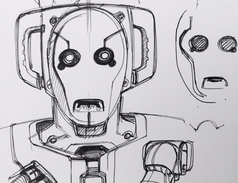
- A more recent Cyberman concept design from Matthew Savage.
ALEX: I grew up with Tom Baker’s Doctor and dimly remembered all the stuff I was asked to paint. As a concept artist, you feel like you have to modernise and update everything, but aside from a few tweaks, it didn’t really need it. Those aliens and creatures that keep coming back are generally strong, both in terms of character and design. They have reached the point where the design transcends good or bad and becomes simply iconic.
DAN: As a kid growing up I was obsessed by Doctor Who. I kind of left it behind when I was about 12 or 13 but it all came back to me when I came to work on it in.
WHO SFX: Was it exciting to be asked to redesign the Cybermen?
MATTHEW: I was more excited to be working on the Cybermen than anything else. It always felt like there was more leeway to develop them because they had changed more over the years than the Daleks had. Our Dalek was always going to be a very traditional looking piece of kit whereas the Cybermen had more scope to change – so long as you protect certain elements. For me it’s always about the ratio between the eyes, the mouth and the handlebars and if you get that right you’ve kind of nailed it. As long as you keep those three elements there’s a lot more wriggle room to move it around a bit.
WHO SFX: Were you given detailed instructions about what should be retained?
MATTHEW: It kind of evolved. There were a lot more people involved with the Cybermen than the Daleks. Off the top of my head, there was Neill Gorton’s team, Neill himself, Dan Walker, Alex Fort, Peter McKinstry and others. Russell (T Davies) would also chip in quite a lot as well. Dan didn’t normally work on Doctor Who but Ed Thomas (Production Designer) valued him so much that he brought him in. They didn’t want to miss a trick so they gave everyone a shot. There’s a bit of everyone in the final design as well.
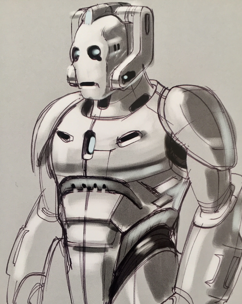
- One of Dan Walker’s early concept designs for the new Cybermen.
DAN: All my concepts, sketches, thoughts – were from memory. I remembered the teardrops and I kept them as a nod to the old Cybermen, but I didn’t look at any of the old ones for reference. That was possibly my downfall. I should have emphasised the handlebars more and played up the more iconic elements. I was focusing on making them as emotionless as possible and getting a kind of purity.
MATTHEW: The brief evolved into specifying certain art deco elements as the episode was going to have that kind of setting. It was going to be a contemporary parallel Earth but with more 1940s art deco elements in there. From memory, this wasn’t overly apparent in the finished episodes. The art deco influences were something that Russell mentioned a number of times. I think you can see some of that in the face and the engineered elements still feel slightly art deco.
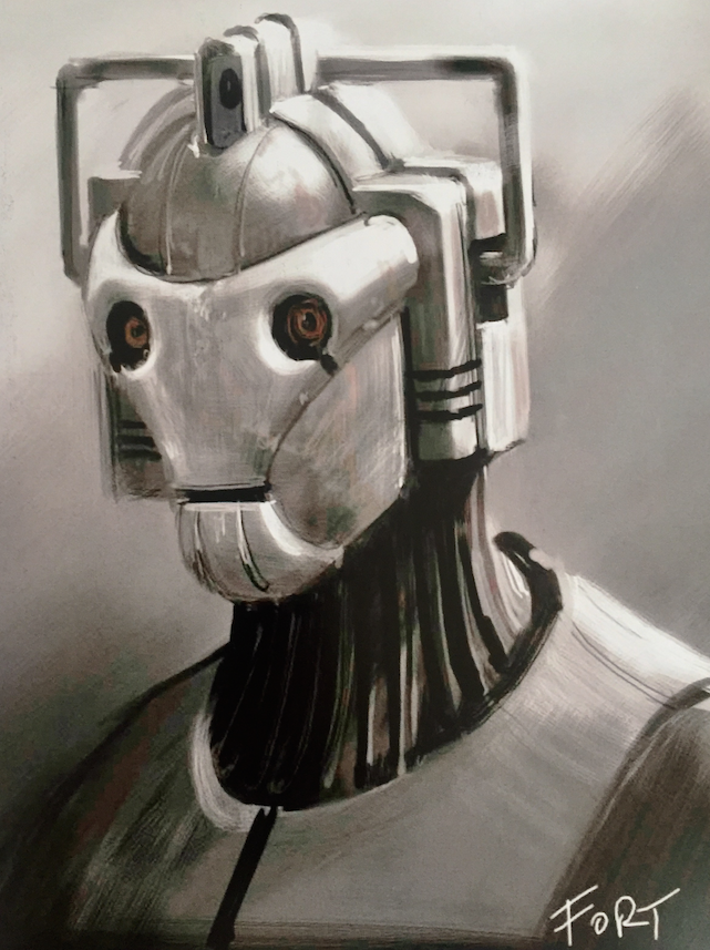
Art Deco Cyberman by Alex Fort.
WHO SFX: Were the new Cybermen originally going to have a more organic look and feel?
MATTHEW: At one point, it was going to be closer to Spare Parts to the point where they paid Marc Platt some royalties. They then moved away from that and considered something like an Apple Shop where you’d go to get your body tuned up. In the back of one of these shots you’d have seen the Mark I Cyberman. It would have been really bulky, like a bodybuilder, because there would have been so many components they were trying to squeeze into this huge suit. I remember doing a concept drawing of an overweight Cyberman with all this technology bulging out at the seams.
DAN: I was influenced by The Tenth Planet. There’s something very unnerving about that simple white balaclava mask. I remember sitting in the park, cross-legged with a pen and a pad, I was reminded of Halloween, the Michael Myers/William Shatner mask – that blank, emotionless expression and black eyes. That’s certainly what I was going for with for the fascia. I was probably going against the brief because Ed wanted art deco and it was Alex Fort who ultimately nailed it. They went with his design in the end because he captured the essence of what they were after.
MATTHEW: I never worry about being too gruesome because I’m not a producer. But I do remember when we showed that to Russell he said it was too gruesome. He also wanted a traditional Cybermen helmet and a metal suit as opposed to a cloth-faced Tenth Planet Cyberman.
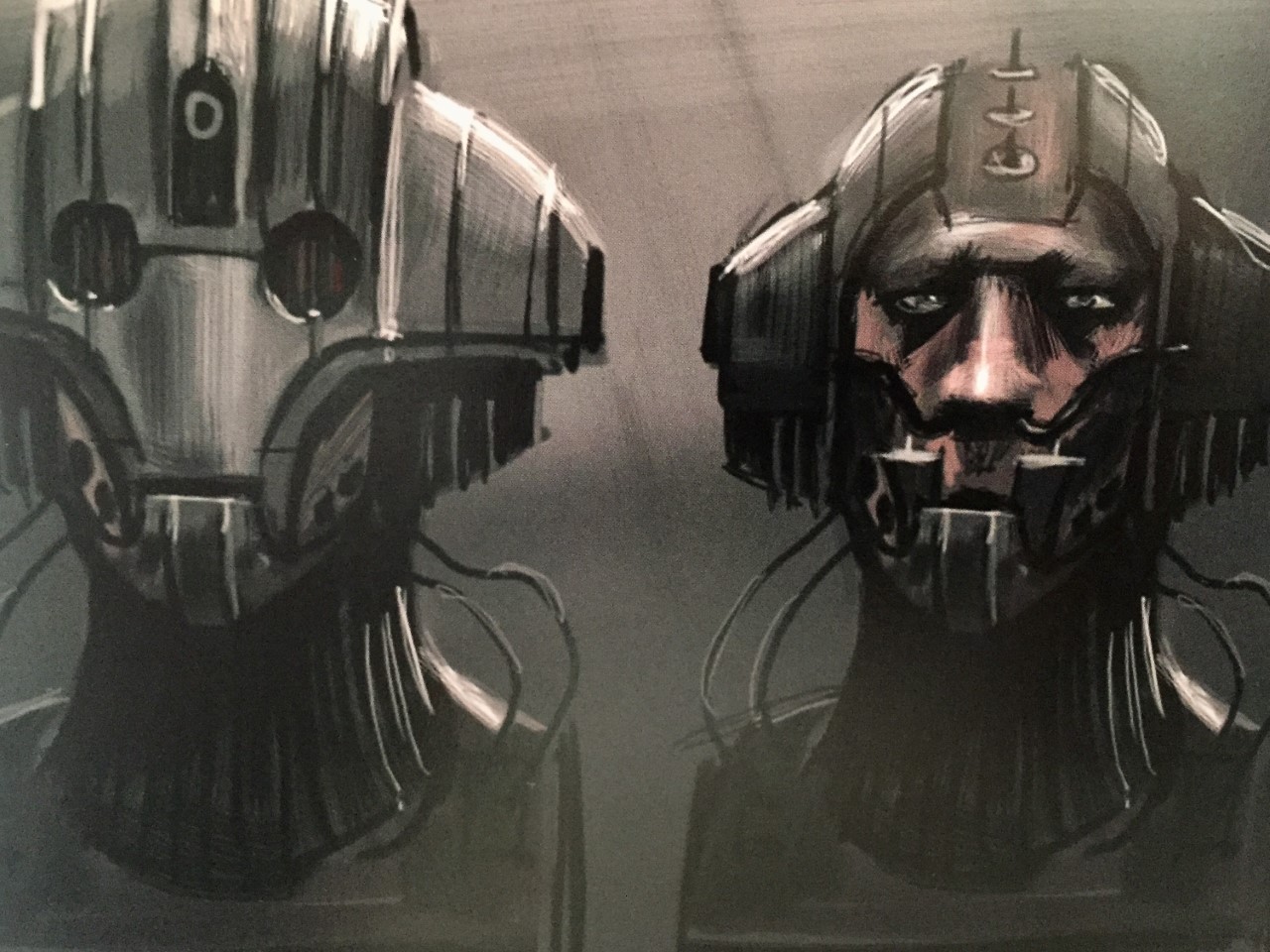
- Wonderfully gruesome concept art by Alex Fort showing a more organic Cyberman.
ALEX: During Series One, I’d painted a few versions of the Cybermen, concentrating on the face. At this stage, no-one had said the Cybermen were coming back, but you knew it was going to happen. I refined these paintings later, and they ended up on the wall of the Art Department. I think they stayed there a while before any decision was made. Perhaps it was familiarity, but the final skull-like version of the head was very similar to one of my designs. I liked it, but it wasn’t my favourite.
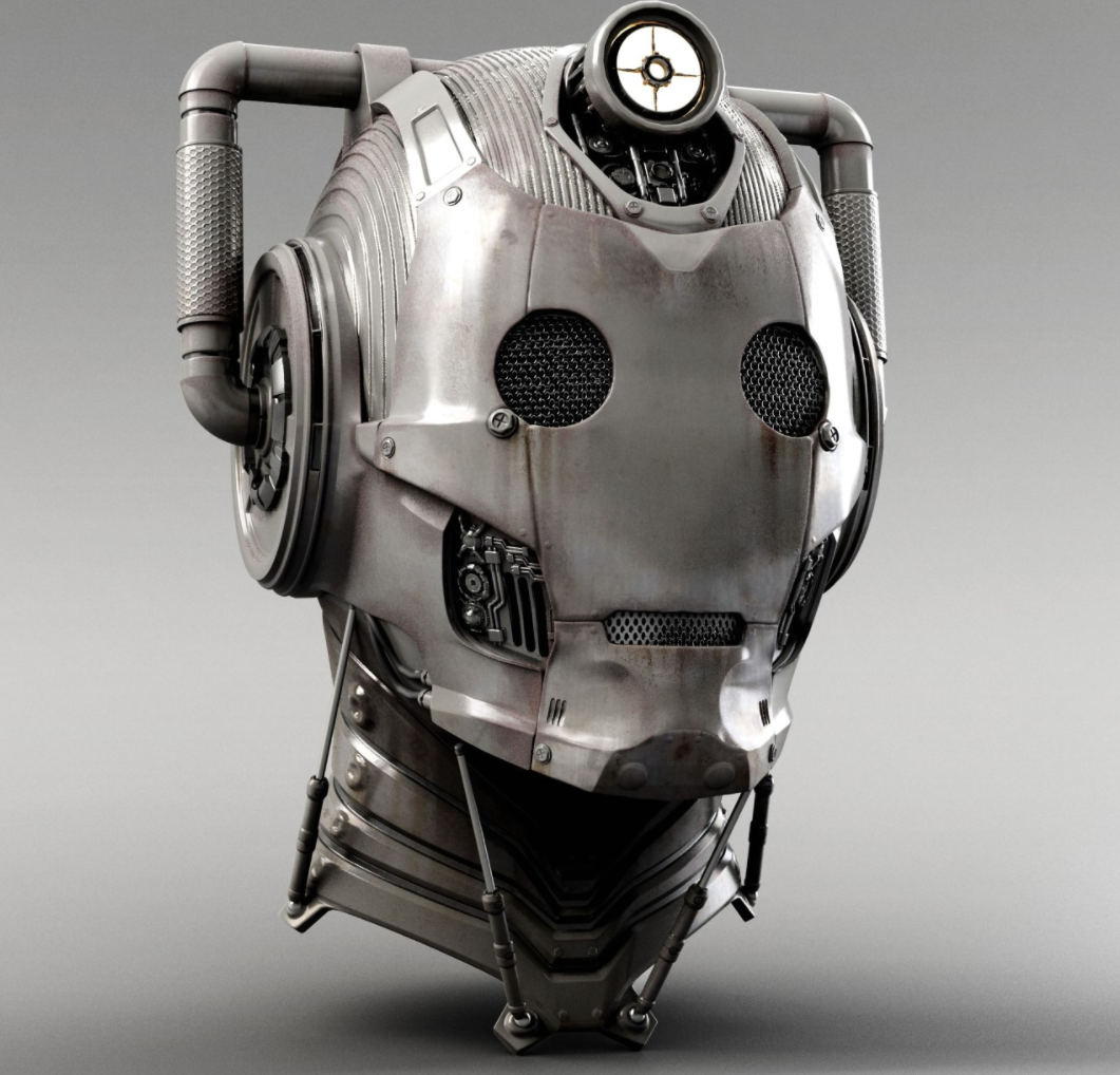
MATTHEW: The Tenth Planet was a great design. I know they’re coming back in some shape or form in the new series. I wish they’d take that old design and run it through with modern textures and fabrics. It’s all there in the design. All you’d need to do is bring the bulk down a bit and play with the proportions, you could come up with something really horrific.
- Cyberman concept art by Dan Walker.
WHOSFX: Was there a lot of pressure to get the design right?
MATTHEW: It’s a bit like Star Wars because everyone is very fond of these things they remember from their childhood and they all have an idea of what they should look like. Ultimately we were trying to please Russell’s because it was his baby.
DAN: I didn’t speak to Russell at all. Ed Thomas was my point man. I was working on Watchmen at the time so Doctor Who was more of a sideline. I always dealt primarily with Ed. He said to all of us that we had carte blanche, ‘knock yourself out and have fun’. Although he did mention art deco which I completely ignored! I think everyone had a fair crack of the whip, some more than others, understandably.
MATTHEW: It was more challenging than the Dalek because it’s a suit that has to be worn by a number of actors. Most people can fit inside a Dalek. Poor old Neill Gorton had to design a rigid suit that would have to fit a multitude of different body types. Even though it was people who were roughly the same size, it’s still a really tricky thing to do.
WHO SFX: Were you happy with how the design turned out?
DAN: I only had about one or two days on it because I was on another job at the time. I would have loved to have been on the job wholesale so I could have fully engrossed myself in it, but I think I contributed something to the overall design.
MATTHEW: I do remember finishing one particular image with Ed and we showed it to Russell and he said, “We’re good to go”. It was a champagne moment but we were too tired to celebrate! That was the design that Neill Gorton then developed. His boys were designing as they sculpted the ‘skull’ so it was like we were passing the baton to them. They were the poor swines who actually had to realise this thing.
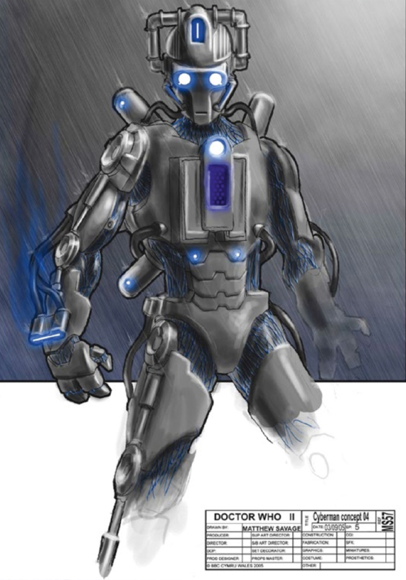
- Concept art by Matthew Savage.
NEILL GORTON: At the same time as Ed Thomas’ art department were going through the pre-design process, we were working on our own designs. Russell liked Alex Fort’s design of the Cyberman head but it did not translate well when it came to being realised in ‘real life’. 2D artists rarely design in a way that can be reproduced identically in the real world. With the clock ticking, Martin Rezard and I had to basically start from scratch and we had to move quickly to keep us on schedule. I suggested we nail the head first. The art deco idea had come up for discussion and Martin and I went down a more elegant route. We’d done a previous maquette which we partially referred back to and I suggested that we explore making the face more skull like. We also brought in more deco lines flowing from the back to the front across the head. The first pass was almost identical to the final design except it had square ear muffs. I changed those to rounded ones and we did a couple more tweaks.
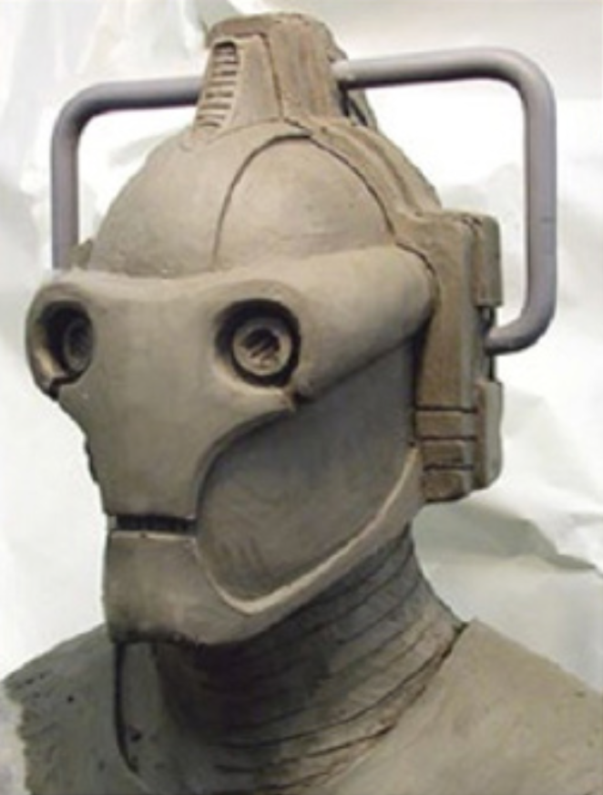
The first life size rendition created by Neill Gorton and Martin Rezard based on Alex Fort’s design. The design was subsequently changed to make it work in three dimensions.
NEILL: While the art department did a lot of great concepts for the Cybermen, the actual finished design was done by Martin Rezard and myself. It was done in literally a couple of days and we were in direct discussion with Russell and Julie.
When this was approved we moved swiftly on to the body. We prepared a maquette that was basically the finished look. This was something that Martin (Rezard) bashed out in a day. This basically nailed the final look in one pass. We took an image of the body maquette with the head sculpture photoshopped on. This gave us our approved look and we launched straight into building the full scale version. A lot of the art department designs incorporated a very accurate head, because they were was based on the picture of our sculpture.
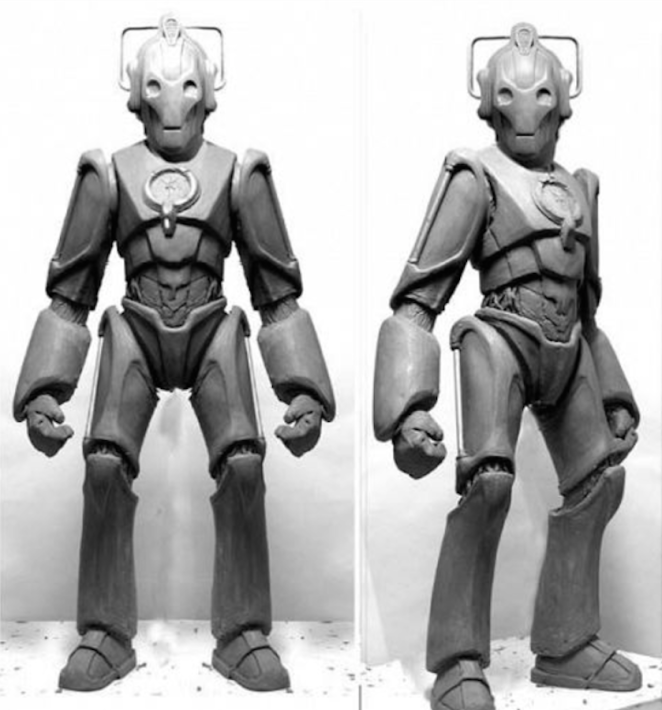
The final approved maquette created by Neill Gorton and Martin Rezard.
NEILL: Very rarely did my design work go via the art department other than when there was a specific crossover to consider. Ultimately the elements that did come from the art department were the idea of the handlebars continuing on the arms and legs, the Cybus logo itself and the suggestion of an art deco feel.
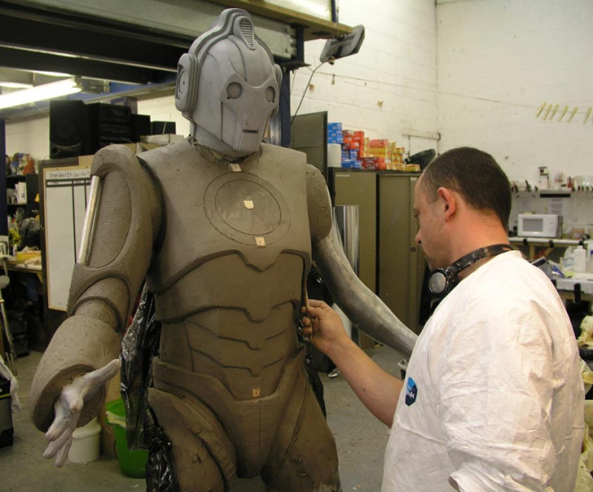
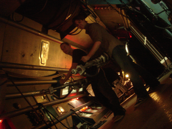
Chief sculptor Martin Rezard at work in the Millennium FX workshop.